Email Marketing with Target

*Disclaimer: I am not employed by or affiliated with Target. The information presented here is for educational purposes only. During this week’s Tuesday evening lecture we learned about email marketing and its importance in client outreach. We also learned about the different types of emails and their advantages as well as having a goal of sending the right message at the right time to the right people. With our weekly design showcase assignment we were tasked with creating an email for the brand campaign used in last week’s banner ad assignment. For my banner ads last week I focused on a back to school campaign for Target.  With my email design I wanted to create something that looked really similar to Target’s branding and something that they could send out immediately. For inspiration I looked at my inbox and recent emails received from Target (sample below).

Target email
Target email

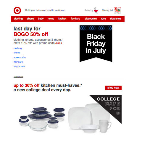
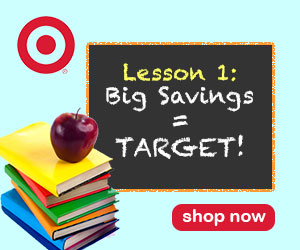
I noticed each email from Target had the logo in the upper left corner followed by navigational panel and text with images below. I also noticed the text used for the ads was always in lowercase. I wanted to incorporate my leaderboard banner ad from last week but knew I needed to alter it. I chose to remove the logo and Lesson 1 text so that it looked like below.

Banner ad
Banner ad- Before
New Leader Board Banner Ad

For my email I wanted to have an attention grabbing subject line and chose to go with: HUGE savings on school supplies. The goal with having the word HUGE in all caps would be to catch the attention of the viewer. I know personally if I saw this in a subject line I would stop to read the email. For the body of the email I used a similar format to what Target currently has with their logo and navigational panel. I chose to add my banner ad below the panel in case the viewer chose not to read the entire email they at least have an image and call to action right away. For the promotional text I focused on school items that most people need and chose to offer discounts on backpacks and notepads/binders. Since I was following the Target email look, I knew I wanted to have text on the left with images on the right. I searched for images of school children wearing backpacks and found a great image on this site. I used the magic wand tool and eraser tool to remove the background in Photoshop and replaced it with a purple color that went well with the blue from my banner ad. I searched Target’s website for information about their font and was able to download a recommended close substitute, Mytupi Bold Font. I also found an image of school supplies that I saved and used in my free shipping promotional section. For the buy one, get one free ad I found an image online of a stack of notebooks that had great colors and fit well with my overall look. Once I had these elements in place I searched for social media icons to use online and downloaded a set that used circles to go with Target’s bullseye logo. For the sections about contact information and preferences I pulled the text directly from a Target email. I thought the wording was great and I wanted to use text that the company would in their email. My completed email ad is below. The sections in red and blue in the email are intended to represent interactive links.

Target email
Target email

On Target with Banner Ads

During Tuesday night’s lecture this week we learned about banner ads and their importance as the principle form of revenue for site owners.  We also learned about the different types of banner ads and ways in which they were displayed. These ads are a great source of outreach for businesses with higher engagement than tv ads and outdoor ads. With banner ads you get a huge return on your investment.

For our design showcase this week we were tasked with designing a banner ad series for a brand of our choice for a third quarter campaign. Thinking about the months in the third quarter: July, August, and September, fall and back-to-school immediately came to mind. The idea of going back to school really stuck with me and I thought of places that I would normally shop at for school supplies. My go-to store for school supplies = Target!  I love Target so I decided to use this as my brand choice.

To research for this assignment I first went to Instagram (it’s my social media of choice) to looked at the images Target posts and noticed a trend of solid background colors that were somewhat bright with real images placed on top. I wanted to incorporate these elements in my ad and I was able to download Target’s logos from their website.

@target Instagram photos

I first searched stock image sites for photos of school supplies without much success. I then did a Google search for the words “cool school kids” and “cool school supplies” and found images of children that I thought about using. When I started working with these in Photoshop I thought my ad was looking too busy so went back to focusing on just school supplies. I found an image of a stack of books on this website and knew I wanted to use it. I saved the image and pulled this into Photoshop to remove the background and other elements to focus on the books.

Screen Shot 2015-07-10 at 11.59.48 PM

Once I had my main image I started thinking about background colors for my banners. I decided a lighter blue shade would work well with Target’s red logo and looked at a few shades of blue. Once I had those two elements I wasn’t quite sure where to go. I started thinking about school and remembered the chalkboard assignment from earlier in the semester and thought it would be nice to bring in a chalkboard with my promotion text on it.

The four different banner ad sizes that we had to create a design for:

  1. Leaderboard: 728 x 90
  2. Rectangle: 300 x 250
  3. Skyscraper: 160 x 600
  4. Button: 320 x 75

The first banner I designed was the rectangle. From there I created the other required files. I had to edit the chalkboard size and text but for the most part the elements worked in each layout. I did have the most trouble with the button ad: 320×75 size, designing a few variations.

With this assignment we were required to turn on one of our banners into an animated 3-panel .GIF banner ad.  I went with the first banner I designed (rectangle) to set this up in frames in Photoshop with a 3x loop.

*Disclaimer: I am not employed by or affiliated with Target (I just love it!). The ads presented are for educational purposes only.

Rectangle Ad: 300x250
Rectangle Ad: 300×250
Leaderboard
Leaderboard
Skyscraper
Skyscraper
Button: 320 x 75
Button: 320 x 75


3-Panel .GIF Banner Ad

Building a Foundation Wireframe Style

During this week’s lecture on Tuesday we were introduced to wireframes and their importance in the web design process. A wireframe is an image or set of images that display the functional elements of a website while helping to establish a site’s structure and hierarchy. There are many reasons a wireframe is important, one of the most valuable being their ability to help you save time and money in the long-run.

With our design showcase we were tasked with choosing our favorite restaurant and designing a wireframe for them with a set of features. It was hard for me to choose a favorite restaurant but I immediately thought of the food delivery service, Blue Apron. My fiance and I have been using Blue Apron for over nine months and love it. Every Tuesday we receive a box of ingredients and recipe cards for three meals (usually dinner). The wonderful thing about Blue Apron is that we receive the exact amount of food we need, usually measured out for us so we never have too much or end up throwing food away.

Blue Apron has a great website so I didn’t choose the company because I thought their site could use a redesign, I instead chose the company because I have a personal connection to it. The assignment required the format be: 1280 x 972 pixels and I chose to have my site centered with text falling within 1,000 pixels wide. Another requirement for the assignment was too use these elements on the homepage:

  • Logo
  • Navigation menu
  • Social media icons
  • Rotating slideshow image
  • Upcoming events/specials
  • Three feature areas (pictures and/or copy)
  • Contact Us area
  • Another feature of your choice

Blue Apron has a great logo and I also love that the text on their site is in dark blue and not black which I would keep with a homepage re-design. Currently the logo is on the left with the navigation panel immediately following (below).

Blue Apron Current Site

I would keep the logo in the same location but include a tagline/few words that describe what Blue Apron is about beside the logo. I would then place the navigation panel immediately below (my wireframe example below).
Screen Shot 2015-07-05 at 10.09.50 PM

With keeping in mind that most people read a site from left to right then top to bottom I wanted to include important details in the upper left portion. Most sites have a sign in or register section to the right so I wanted to keep this the same. A change from their current homepage is including a video below the navigation panel. I find the concept of Blue Apron to be great and  quick video that tells the viewer what it is about and how it could be beneficial for them would work well on the homepage.

I am including an image of my new wireframe and will go through the additional choices made for item placement.

Blue Apron Wireframe *Disclaimer I am not affiliated with Blue Apron and this is solely for educational purposes.
Blue Apron Wireframe
*Disclaimer I am not affiliated with Blue Apron and this is solely for educational purposes.

To the right of the video I wanted to include a rotating image of different Blue Apron meals. Below the video I have a section for events, this is more of a placeholder at the moment and can be replaced with a different type of announcement. Underneath the rotating images I wanted to have three sections with images and text. I chose to have these areas to really breakdown what Blue Apron is all about. Currently on Blue Apron’s homepage you have to scroll down to get to these sections whereas with my re-design the information is presented without having to scroll so much.

Blue Apron has gotten a lot of great press so I wanted to include a section that highlights this on the homepage. With Blue Apron the goal is to get clients to sign up for the service and while social media is important for them, I would not view it as their top priority. With this in mind, I placed the social media icons in the footer section. The social media icons I used were found on this site.

I really love the blue color that Blue Apron currently uses so I would keep that while also incorporating a beige color and greys that would work well with this blue. I took screen shots of the images below from Blue Apron’s site and used my Eyedropper Tool in Photoshop to get color reads on the tomatoes. I wanted to incorporate accent colors that you would find from food and went with an orange/brownish tone and a red tone.

As I mentioned earlier I am not affiliated with Blue Apron but if you are a looking for a great way to save on time, food costs, and waste, I highly recommend them!

Color Inspiration
Color Inspiration
Color Inspiration
Color Inspiration

In the Mood for a Wedding

During Tuesday night’s lecture this week we were introduced to the concept of moodboards and their importance in the design process. A moodboad is a collection of images, text, colors and/or patterns representing a theme in a collage format. Moodboards are a great tool to help illustrate a design style you are striving for.

For this week’s design showcase we were assigned the task of creating a moodboard based on personal brand/website, work campaign, or other campaign of our choosing. I am currently in the wedding planning process and would love to create a website for my wedding, moodboard inspiration = found!

A few of the requirements for this assignment, use at least three stock images, the 2015 Pantone color of the year (Marsala) plus two additional Pantone colors of the year, and an action.  When searching for the additional Pantone colors I knew I wanted to use a neutral shade but I was undecided on my third color. I searched online to locate a list of colors of the year and really liked the 2006 color, Sand Dollar. I debated on using a fuchsia, emerald, or blue shade for my third option and ultimately went with Cerulean (2000 color of the year). The CMYK and RGB values for the Pantone colors are included below.

Pantone Colors
Pantone Colors

Since I knew the theme of my moodboard, I decided to search for stock images to incorporate. I chose to search for images on a site that I found while researching for last week’s discussion post: StockSnap.io. I used these keywords: wedding, suit, and bouquet and came across the images below that fit well with the look I am going for.

Suit- Stock ImageWedding- Stock ImageBouquet- Stock Image

My next image search was for shoes and cake. I wasn’t happy with the selection from stock images so I looked on Pinterest and Flickr for inspiration. I saw a lot of great cake photos on Pinterest and chose one that had a classic look to it. To enhance the colors on the cake, I used the color replacement tool to change two of the flowers to Pantone Marsala. The before and after are included below.
Screen Shot 2015-06-28 at 3.15.05 PM Screen Shot 2015-06-28 at 3.15.15 PM

My fiance and I are currently looking at having our wedding at the Watergate Hotel in Washington, DC and I wanted to incorporate an image of the venue on my moodboard. I had a few to choose from that were sent to my by the hotel’s event manager.

The last image I searched for was invitations/Save the Date cards. I found a great image of the DC Cherry Blossoms from Rifle Paper Company and saved this to my desktop. I opened the image and used the color replacement tool to change the water to Pantone Cerulean (before and after images below).


*Disclaimer: The use of this image is for educational purposes only. I am not affiliated with Rifle Paper Company.

Once I had all of the images I decided to start creating my moodboard. I opened a new file in Photoshop with the dimensions at 10″ x 8″ and began placing my images without any real plan. Full disclosure, I thought it would be easy to just place images and move them around to create my moodboard, I soon discovered I was very wrong. The initial design I started is below. I was really unhappy with the look and and knew I needed to start over and approach this assignment differently.

Original Moodboard
Original Moodboard

While brainstorming I decided I wanted to have theme words placed in my layout and chose to use romance, elegance, and classic to describe my ideal wedding theme. When re-designing my moodboard I also thought about the layout and what images I wanted to emphasize. I created a new file in Photoshop and chose to go with the dimensions at 8″ x 10″ and used my guide lines to map out a grid. I started placing images to get a feel for the look I wanted and was much happier with the overall look.

Once I had the layout in place I decided to go back and open the original stock images to add actions to give two an “antique” appearance. I really loved the look of the bouquet and used that as inspiration when searching for actions that I could apply to my other images. I downloaded a set of free actions from Shutter Pulse (another great find from research this week) and applied the Old Film action to the image of the dress and close-up of the suit. I toggled off a few of the effects so the images weren’t too dark.

As I was editing the images I placed them into my new layout and used clipping masks to crop images and clean up the layout. I deleted the old layers and grouped items to clean up my file. My final Wedding Moodboard is below.

Wedding Moodboard
Wedding Moodboard

Birchbox-in-Gap IMC Ad

During Tuesday’s lecture this week we learned about Integrated Marketing Communications (IMC) and the importance of companies and organizations using cohesive messaging across their various media channels. With our design showcase the task was to develop an ad for a favorite brand that could ideally be used on the web to go with a current campaign utilizing IMC.

My favorite company at the moment is Birchbox. The concept behind Birchbox is to allow women to easily and efficiently try, learn about, and purchase beauty products online. As a customer you can subscribe to a monthly delivery of beauty samples that are tailored to your beauty preference. After trying the samples you can review the products on Birchbox’s site and purchase the product in full size.

Birchbox uses a lot of social media for product promotions and I currently follow them on Twitter, Facebook, Instagram, and Pinterest. Birchbox is great about incorporating IMC into their different channels to keep the look and messaging cohesive. While Birchbox is known primarily as an online store, they have recently started a partnership with Gap to sell their products in select stores in the US. For my design showcase I chose to use the Birchbox-in-Gap campaign as inspiration. I have included a few examples of their current campaign on various social media channels below.

Twitter ad: https://twitter.com/birchbox
Facebook ad: https://www.facebook.com/Birchbox
Instagram ad: https://instagram.com/birchbox/

When starting my ad I knew I wanted to have an image of the Gap store. I was able to find a great image of the store on Wikipedia Commons (which I had never heard of or used before) that I downloaded to my desktop. I then opened a new file in Photoshop with the dimensions 800 x 600 pixels and 72ppi. I opened my image of the Gap store and pulled this over to my new Photoshop file.  I scaled the image down and cropped this to fit my layout.

Once I had my background image in place I looked through their social media accounts to find a woman that represented a typical Birchbox client to include in my ad. I found an image on Instagram and was able to remove the background from it to pull into my new ad.

Since my background image had Gap’s logo already included, I wanted to add Birchbox’s logo to the banner portion to make it appear as if the image was created this way. I found Birchbox’s logo on their Tumblr after a Google search and opened this in Photoshop to check the image size. I cropped the file down to focus on a logo with text and removed the background to drag this into my ad adjusting the size to make it proportional to the Gap text. To make the text blend in a bit more I added a drop shadow to give it some dimension.

Birchbox

My next step was to add an image that I could place text in with information and the call to action. I started with an orange color banner (below) but wasn’t really happy with it. I started to play around with shapes and created a layered square shape that I was much happier with felt fit in well with the Birchbox brand. I played with the direct selection tool to change the shape of the box to make it slightly skewed to go with the background and adjusted the opacity. I added a diamond shape on top to add a bit more dimension.

Orange banner
Old Banner
New Banner
New Banner

Before placing text in the new shape I wanted to make the visual details in the photo image behind it black and white so the text over it would be easier to read. To achieve this look I used the direct selection tool and applied a layer mask with a black and white adjustment. I noticed I wanted a few additional areas to be in black and white so repeated this step two more times.

The text I used in my ad was pulled directly from Birchbox’s IMC ad for the Gap partnership. Since I wanted this to look like something they could use right away I chose to include actual text from the campaign. I included the website and hashtags as calls to action. With the hashtag, I wanted to use some color on the name so I applied a layer style gradient of purplish-pink and orange which are common colors in Birchbox ads.

My finished ad is below, enjoy!

Disclaimer: I am not affiliated with Birchbox or Gap and this ad is solely for educational purposes.