During Tuesday night’s lecture this week we learned about banner ads and their importance as the principle form of revenue for site owners. We also learned about the different types of banner ads and ways in which they were displayed. These ads are a great source of outreach for businesses with higher engagement than tv ads and outdoor ads. With banner ads you get a huge return on your investment.
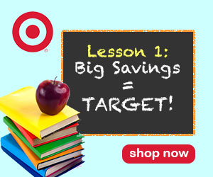
For our design showcase this week we were tasked with designing a banner ad series for a brand of our choice for a third quarter campaign. Thinking about the months in the third quarter: July, August, and September, fall and back-to-school immediately came to mind. The idea of going back to school really stuck with me and I thought of places that I would normally shop at for school supplies. My go-to store for school supplies = Target! I love Target so I decided to use this as my brand choice.
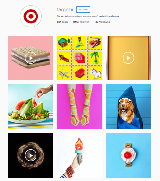
To research for this assignment I first went to Instagram (it’s my social media of choice) to looked at the images Target posts and noticed a trend of solid background colors that were somewhat bright with real images placed on top. I wanted to incorporate these elements in my ad and I was able to download Target’s logos from their website.
I first searched stock image sites for photos of school supplies without much success. I then did a Google search for the words “cool school kids” and “cool school supplies” and found images of children that I thought about using. When I started working with these in Photoshop I thought my ad was looking too busy so went back to focusing on just school supplies. I found an image of a stack of books on this website and knew I wanted to use it. I saved the image and pulled this into Photoshop to remove the background and other elements to focus on the books.

Once I had my main image I started thinking about background colors for my banners. I decided a lighter blue shade would work well with Target’s red logo and looked at a few shades of blue. Once I had those two elements I wasn’t quite sure where to go. I started thinking about school and remembered the chalkboard assignment from earlier in the semester and thought it would be nice to bring in a chalkboard with my promotion text on it.
The four different banner ad sizes that we had to create a design for:
- Leaderboard: 728 x 90
- Rectangle: 300 x 250
- Skyscraper: 160 x 600
- Button: 320 x 75
The first banner I designed was the rectangle. From there I created the other required files. I had to edit the chalkboard size and text but for the most part the elements worked in each layout. I did have the most trouble with the button ad: 320×75 size, designing a few variations.
With this assignment we were required to turn on one of our banners into an animated 3-panel .GIF banner ad. I went with the first banner I designed (rectangle) to set this up in frames in Photoshop with a 3x loop.
*Disclaimer: I am not employed by or affiliated with Target (I just love it!). The ads presented are for educational purposes only.