Coffee House Chalkboard Ad

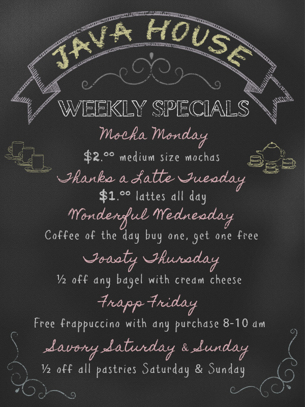
This week’s design showcase focused on using layer styles, ornaments, and fonts to create an ad for a coffee house. The goal for the ad is to create something that can be used on their website to promote specials, entertainment or a topic of our choosing. I decided to use a local coffee shop, Java House as inspiration for the project. This has become my go-to coffee place as of recently due to it’s close proximity to my condo. I tried to be as discrete as possible when taking a few photos of the coffee house to get a better feel for their product offering .

Java House
Java House

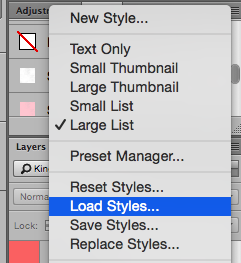
With this assignment we were supplied with a set of chalk backgrounds, chalk styles, and ornaments. After downloading the supplied files, I looked at the backgrounds and chose the first image which seemed to be the least modified. I knew I wanted to add an effect to this later to give it a chalky look but wanted to wait until the ad was formatted first. I opened the background image in Photoshop and kept the size at 600 x 800 px. My next step was to load the supplied layer styles by going to the drop down box in my Styles panel > Load Styles and grabbing the file that I saved on my desktop.

Loading Styles
Loading Styles

To get some inspiration for my ad I looked at the supplied ornaments and chose to use a curved banner to help create a logo for the store. Once I opened this and dragged it to my background I had to modify the size quite a bit and altered the shape of the arc. As I went to type out the name Java House I noticed there were not many chalk style fonts to choose from in Photoshop so I went online to search for some. I first went to dafont.com and downloaded a few options. I also went to 1001 Free Fonts to get a few more fonts. I decided to use a font style called Colored Crayons from 1001 Free Fonts for the name. Once I had the text in the banner I added tracking to the letters. Tracking is a tool found in the Character panel that allows you to adjust the spacing between a range of characters. For the font color, I chose to use a yellow color supplied layer style with an opacity at 70%.

Java House before tracking
Screen Shot 2015-06-07 at 9.30.33 AM
Java House after applying 100 tracking

For my ad I wanted to create a list of Weekly Specials. I played around with the chalk style fonts and changed a few of these out in the process. Once I had the Weekly Specials text, I went back to the supplied ornaments to add one under the name and in each corner in the bottom. I adjusted the opacity of these to give it a worn chalk-like appearance. My next step in the process was to brainstorm ideas for the names of each daily special. I wanted to have a play on words but Wednesday was a bit of a stretch. I started with Mocha Monday and once I had the font and style formatted I duplicated the layer to add the rest of the days. To save on space, I combined Saturday and Sunday. To increase the space between Savory and Saturday I added kerning. This is another text option found in the Character panel that allows you to adjust the spacing between two characters.

Before Kerning
Before Kerning
After Kerning
After Kerning

I went to the coffee house yesterday morning to get some inspiration (and coffee) for each day’s discount. I followed a similar step by setting up Monday’s discount first and duplicated the layer to add the rest of the days. At this point I had a lot of layers so I color coded them to make it easy to navigate through the list for edits. To add some character to my ad I looked at wingding/dingbat on the 1001 free fonts site and downloaded a style that was called Cooking Set. This font style had had coffee cups and a tea set that fit well with my layout.  Once I had these added I adjusted the style, size and opacity. To finish my ad I used the dodge tool create some lighter areas around the text to give it a chalk residue look. The results are below!

Java House Chalkboard Ad

Adjustment Layers, Masks & Tools

This week’s design showcase was about working with adjustment layers, masks, and tools to modify a provided image. We were provided three images from which to choose and I immediately gravitated towards the bouquet image which may have to do with the fact that I was at a wedding this weekend and am currently in the process of planning my own wedding.

Photo Images for Showcase 3

Once I downloaded my image I opened this in Photoshop and changed the height to 8 inches while the width scaled proportionally to 5.3 inches. My color mode remained in RGB with a 300 dpi setting.

After modifying my image size I duplicated my initial layer so I could use the clone stamp tool to add additional flowers to the bouquet. It was important to duplicate my original layer so I could go back to this if I was not pleased with the look of the additional flowers. The clone stamp tool is a wonderful tool that allows you to sample a portion of an image and duplicate this in another area. Using this tool with an adjusted brush size, and hardness I was able to add more flowers to the bouquet. The before (left) and after image are included below.

Bouquet Screen Shot 2015-05-30 at 12.58.20 PM

Once I had additional flowers in the bouquet I duplicated this layer. To help blend the additional flowers into the bouquet I used the smudge tool. This tool picks up color from where you initially place it and smears it into adjacent colors. It is almost as if running your finger through wet paint.

My next step was duplicating this layer and using the dodge tool to lighten the color on the arm, hand, and white flowers. The dodge tool allows you to lighten pixels within an image using a brush that can be adjusted in size, hardness, range and exposure. I also used the sharpen tool on this layer at the settings below to enhance the details in the ring.

Sharpen tool

The before (left) and after close up photos of the hand and ring are below.

Dodge and Sharpen Screen Shot 2015-05-31 at 11.50.42 AM

Once I made those edits I applied a Posterize adjustment layer to the image. I wanted the image to have an abstract look to it while maintaining the original look of the hand and arm. To achieve this, I added a vector mask to the layer and used the brush tool at 79 px size with black as my color and proceeded to remove the pixels on this layer to reveal the hand and arm in its appearance below. Before I started using my brush I checked to make sure my foreground color was black with white as my background color.
My final step was creating another adjustment layer in Black & White with an 85% opacity. In this layer I wanted everything in the image to appear in black & white except for the bouquet and ring. I used a similar process as I did in the previous layer by creating a vector mask and removing the pixels over the bouquet and ring. Masks are a great tool to use to reveal or cover pixels in an image and can be turned off or removed easily.

Included below are the original image (left), my image in color (middle), and with the black and white adjustment layer with mask (right).

Original_bouquet Color_Childers_designshowcase3 B&W_Childers_designshowcase3

The tools used:

Sharpen Tool
Sharpen Tool
Smudge Tool
Smudge Tool
Dodge Tool
Dodge Tool
Clone Stamp Tool
Clone Stamp Tool
Brush Tool
Brush Tool

Learning Layers

VIC5325 is a course utilizing Photoshop to develop communicative images for web with an integrated marketing communications approach. For week two’s design showcase the goal was to utilize skills covered in class to format an image using layers and tools in Photoshop. In the past I have known that layers existed in Photoshop but was apprehensive about using them since I wasn’t properly trained. After last week’s lecture I am completely sold on layers and understand how vital they are to editing images in Photoshop. Layers help to keep your work organized and give you more control when modifying an image.

For this assignment, the task was to create a BLT sandwich graphic for a fictional client, Albert’s Grille. The first step I took for this assignment was downloading the supplied images from Dropbox.

Photo images for Design 2 showcase.

In addition to the supplied images, I had to find a background image to serve as my tablecloth. I wanted to use a red checkered tablecloth image and was able to find one easily on Flickr . Once I had my background image, I was ready to start building my BLT in Photoshop.

When creating a new file in Photoshop I used the size settings 8 inches by 8 inches at 72 pixels/inch in RGB color mode. Once my tablecloth was placed, I opened my sandwich images in this order: plate, bottom bread, lettuce, tomato, and bacon.

Move Tool
Move Tool
Magic Wand Tool
Magic Wand Tool

After opening the first image I unlocked the layer and used the magic want tool to select and remove the background to make the piece of bread a transparent layer. Once the layer was transparent, I was able to drag this over to the tablecloth with the move tool.

When dragging the image on top of the tablecloth this created a new layer which I renamed for organization. The plate size was much larger than my tablecloth so I re-sized this by selecting the bottom right corner and holding down the shift key to keep the image proportional.

I followed similar steps for the next four items, rotating the bacon slightly once it was re-sized. When it was time to create the mustard and mayo, my process changed. I created two new layers for these items and named them accordingly. For these toppings, the assignment required using the brush tool. To have a more accurate mustard and mayonnaise color, I searched online for images of French’s mustard and Duke’s mayonnaise. Once I had these images, I used my eyedropper tool to get a color read and created new color swatches to use. The eyedropper tool allows you to sample a color from an image to use this color for other elements within an image.

Eyedropper Tool
Eyedropper Tool
Mayo and Mustard
Mayo and mustard color swatches.

My file was coming together and looking nicely with the properly labeled layers. The next step was to add the text, Albert’s Grille to the image.

Sandwich Layers
Sandwich Layers

I chose to use a font that had a diner/all-American feel to it. The font name is Carter One which I downloaded from a free font site online. I wanted the font color to match the blue in the plate so I used the eyedropper tool to create a new swatch. To help the text stand out from the busy tablecloth, I added a 5 pixel stroke in a lighter grey color.

Albert's Grille font
Albert’s Grille font

Once I had the font formatted and checked the layers, it was time to save my file in .psd and .jpg formats.

Hope this doesn’t make you too hungry!

Albert's Grille BLT ad.
Albert’s Grille BLT ad.

A Brief Intro

Greetings! My name is Ashley and I am currently a part-time graduate student in the Web Design and Online Communication program at the University of Florida. I have recently started my second semester and have thoroughly enjoyed all courses so far. The program is online but is by far the most interactive online learning environment I have experienced. Let’s connect! About Me: Ashley Childers  I currently work at the World Bank in Washington, DC in the Printing & Multimedia Department. Outside of work and school I enjoy spending as much time as possible with my fiance, Daniel. We recently got engaged in March in Breckenridge, Colorado. A hobby we both enjoy is biking and we are looking forward to many bike rides in and around DC this summer!

Bike ride to Mount Vernon.

I am currently developing this blog  as part of my Digital Imagery in Web Design course and hope to be able to create a space to house all of the projects I have created so far and will build in this program. I am excited about the “real-world” based assignments in this course and building upon my current experience with integrated marketing channels.