Sunshine Photographics: Visual Campaign with IMC

Company Analysis

Sunshine Photographics is a well-established small business photography studio based in Central Florida. The company was founded in 1991 by Derek Smith and specializes in wedding, portrait, and convention photography. Sunshine Photographics is currently looking to expand their convention photography services and have purchased a new domain, OrlandoConventionPhotographer.com, to help grow the business.

With the goal of expansion for the convention photography services in mind, my proposed campaign will focus on targeting businesses, clients, and organizations with this need. The goal with this campaign is to provide designs that utilize Integrated Marketing Communications across all channels. Given the various marketing channels available for client outreach, it is critical to have consistent and cohesive messaging across the board. As this article states, consistency is key in making sure that consumers understand your marketing message which leads to a great result and return on your investment.

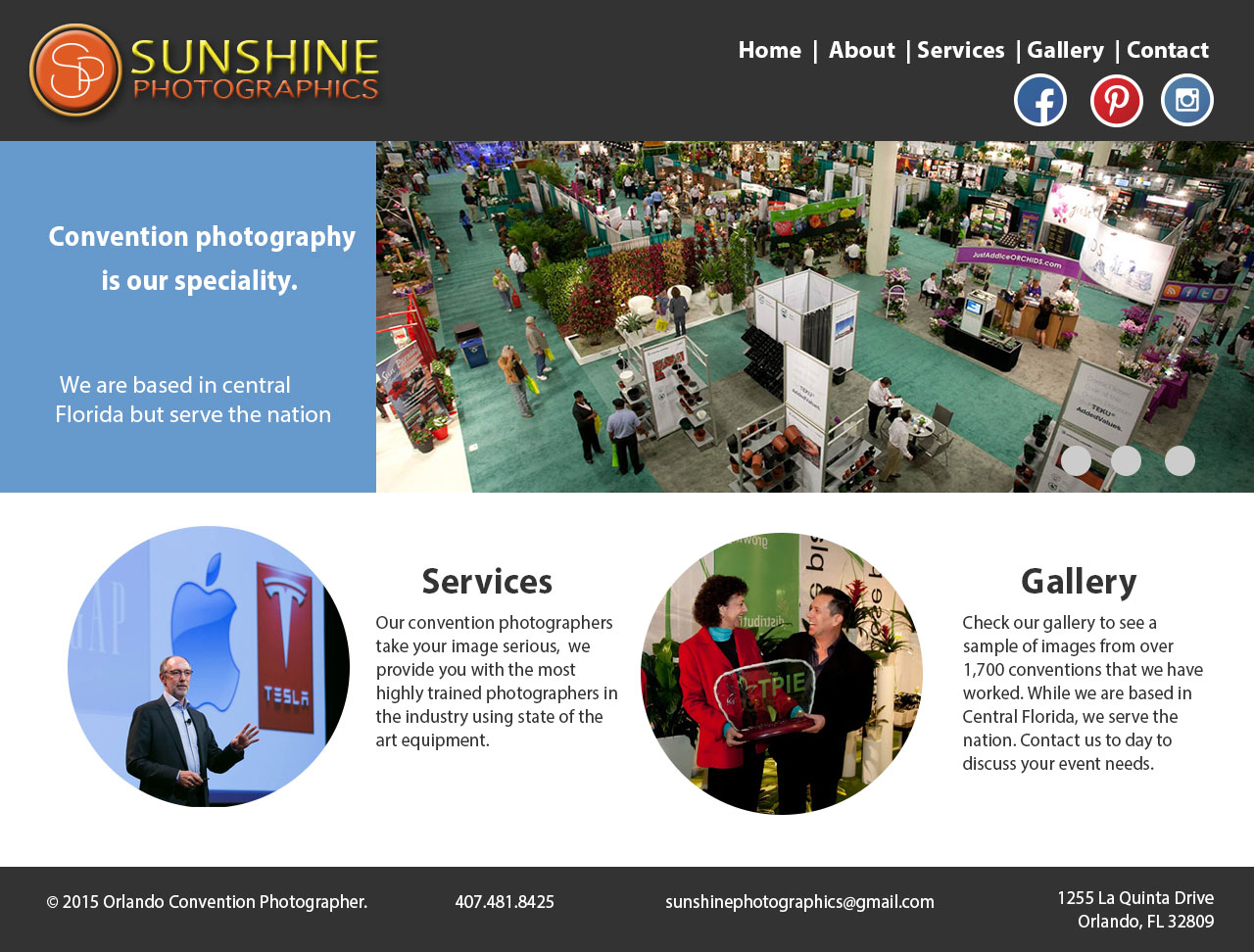
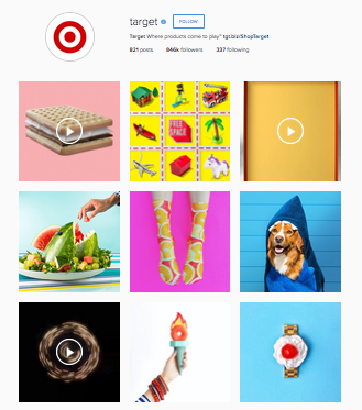
My proposed campaign will focus on building upon your current online presence on Facebook to highlight your full range of services, in particular, convention photography. I also want to use Facebook to start building a following on other social media channels, mainly Instagram. The ads and visuals will focus on convention photography, incorporating images and colors that are currently being used on your site.

Banner Ad Designs

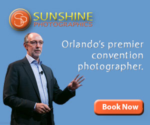
A banner ad is a form of advertising on the web delivered by an ad server with the intentions of attracting traffic to the website of the advertiser.

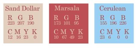
With the banner ads for Sunshine Photographics I wanted to keep the color palette the same to help keep these cohesive. I chose to highlight the website in two of the ads where this worked well with the dimensions.

Leaderboard Banner Ad: 728x90
Leaderboard Banner Ad: 728×90
Button Ad: 320x75
Button Ad: 320×75
Cube: 300x250
Cube: 300×250
Enhanced LeaderBoard: 784x307
Enhanced LeaderBoard: 784×307
3 Panel Gif
3 Panel GIF

Social Media

Currently Sunshine Photographics has Facebook channel with several hundred likes and a five star rating based on client feedback. This is a great opportunity to utilize this channel to highlight your convention photography services (which are currently not being advertised here). I used the blue again that was from the banner ads. I went with a business/serious approach with two of the cover options and more playful with the third.

Facebook Cover Image Option 1
Facebook Cover Image Option 2
Facebook Cover Option 3

With my Twitter cover image I went with a photo collage without any text since the profile photo moves to the center when being viewed on mobile devices.

Twitter Cover Photo
Twitter Cover Photo

With my logo-esque overlay I used elements from the logo to build upon. A demonstration of how this would look placed over an image is below.

Logo-esque Overlay
Logo-esque Overlay

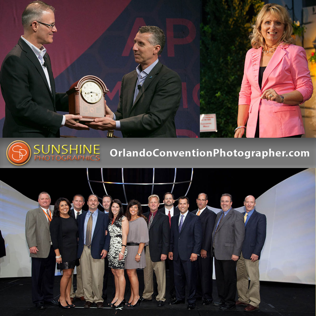
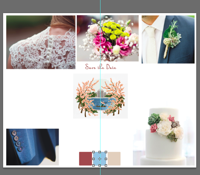
When designing a Facebook timeline image I referenced this guide to create a shared image which had a recommended upload size of 1200×1200. With this image I chose to highlight your convention photography website to help drive traffic to to this site by reaching out to your current audience.

TImeline Shared Image
Facebook Timeline Shared Image

Dedicated Email

With my dedicated email design I chose to incorporate the images that I have used from other designs along with the blue and orange colors. I removed the drop shadow from the logo to help make this easier to read against the white background. I chose to use my email to highlight discount opportunities for clients. I noticed that you currently only have a social media presence on Facebook and Pinterest, I would recommend creating an Instagram account since it is a platform for image sharing which is the industry that you are in. I have a proposed name included that currently isn’t being used.

Dedicated Email
Dedicated Email

Wireframe
My proposed wireframe is a way to highlight more photo images on the home page.

SP Convention Wireframe

Web Page 

Proposed Convention Homepage

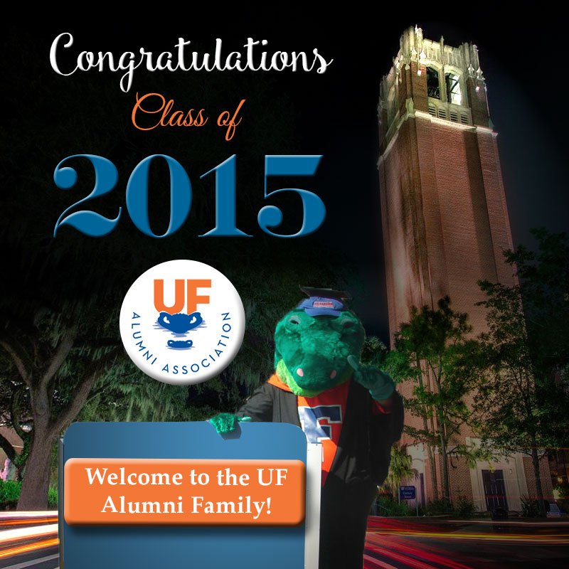
Miscellaneous Graphics

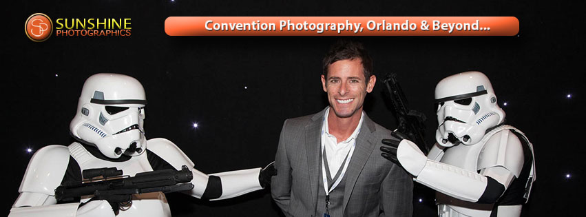
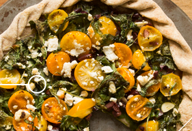
With the misc. graphics I decided to create images that could be used on Facebook since you currently have a page set up and a following. I am personally a huge fan of Instagram, it is by far my favorite social media channel and I think  it is a great way for businesses to connect with clients. I took the opportunity to create ads that could be used to encourage people to follow you on Instagram if you choose to create an account. I really loved the image with the Stormtroopers and used this in a few of my designs.

Shared Facebook Link
Shared Timeline Image

Summary

What I noticed from your Facebook and Pinterest pages is that there is no mention of convention photography. I think these are two great channels that could be used to bring attention to your convention photography services. Given the desire to expand this business line, reaching out to existing followers/friends would be a great start. As someone who is currently planning a wedding I know how critical word of mouth can be to a photographer. Ensuring your wedding clients know you offer convention photography services (if they don’t already) is a great way to spread the word.

I really enjoyed working on this project and had a lot of great photo images to work with. My goal was to keep the visuals direct and simple to use/navigate, which is something the owner mentioned appreciating. The colors used were ones currently being used on the convention website. I used Myriad Pro in many of the text portions since this is the font currently used with the logo. I also incorporated drop shadows and the bevel & embossing effect on several elements to go with the logo. I wanted to showcase Sunshine Photographics as the premier convention photographer in the Orlando area.

To the UF Class of 2015

*Disclaimer: I am not employed by the University of Florida or the University of Florida’s Alumni Association. This assignment is for educational purposes only. Go Gators!

With the end of the semester approaching I have graduation on the brain…even though I am a few semesters removed from it! During last week’s class we learned about lighting effects in Photoshop and how to apply and use them. This was a completely new concept and tool for me and I have to admit, I need plenty of practice with it!

With our final showcase assignment we were tasked with creating an e-holiday card that an organization/department associated with the University of Florida could send out. I decided to use the UF Alumni Association as my e-holiday card “sender” and went with a graduation theme.

To start my assignment I went to UF’s Alumni Association website to find a logo and to get a feel for the organization, which is greatly branded with UF. Once I found a logo I did a Google search for UF graduation images. I found a few options to choose from but once I came across an image of Albert, the UF mascot, in a cap and gown I knew I had to incorporate it in my design.

When I started my design I created a layout that had a gradient effect behind the mascot image but soon realized trying to apply lighting effects wouldn’t work well. I knew it would be much easier to work with a dark photo and apply the lighting effects to that so I searched for UF night campus scenes. I found a great image of Century Tower and decided to use it.

UF Alumni Association

I applied three spot lights to the Century Tower image placing these in areas where light would be coming from (the Tower and streetlights). I also applied the Soft Omni preset to the image of Albert to give the sign to his left some dimension.

When choosing fonts I knew I wanted to choose a script font style for “Congratulations” and “Class of” the fonts I used for these were ones that I downloaded from online and had loaded on my computer. I normally don’t like to use too many fonts but I chose to use two different ones for these because the font used for Congratulations didn’t translate as well at a smaller size. I added the Bevel and Emboss effect to some text portions, the button behind the logo, and orange block in the bottom sign. I decided to apply the effect to these areas to give the look some dimension.

I envision this being a card that would be sent out after fall semester/winter graduation, around the holidays.

Cheese Facts Infographic

*Disclaimer: I am not affiliated with FoxNews.com or the author of this article. The information presented below is for educational purposes only.

We’re getting so close to the end of the semester! During Tuesday’s lecture this week we learned about the pen tool in Photoshop and infographics. An infographic is a visual image such as a chart or diagram used to represent information or data. Pinterest is a popular channel for infographics.

For our weekly design showcase we were tasked with creating an infographic that made use of the pen tool in Photoshop. I am familiar with the pen tool having used it in Illustrator to create shapes but prior to this week, had not used it in Photoshop. We learned about creating paths with the pen tool and how these can be converted to smart objects or used to create masks. Photoshop is a hybrid program that works with pixels but can also store paths (which are created with the pen tool) making it a great program for using the pen tool.

We were provided two articles to choose from for inspiration for our infographic. I immediately gravitated towards this article about National Cheese Day facts and started sketching ideas for my layout. At my job we produce a lot of infographics so the concept of this type of design wasn’t new to me. An issue we often run into at work is that many of the designs are created for the web and then people want to print them as posters which causes trouble since the size of the layouts are usually not in typical print dimensions. With this in mind I wanted to create my layout at a size that could be printed easily if needed so I went with the dimensions 11″ x 17″.

When thinking about cheese a sunny sky and cows immediately came to mind. I wanted to use a color block layout that made use of colors from a sunny day (yellows, blue, and green). I searched the internet for infographics to get some inspiration and came across an image of cheese with brightly colored beams behind it which reminded me of a sun and  I thought it would work well with my layout.  I started my design in Photoshop based off of my sketches instead of creating a wireframe. I’m including my design below and will go through the steps used to create the layout.

Cheese Facts Infographic

In the top portion I used the pen tool to create the “beam” shapes making use of the gradient tool on these as well. I added the image of cheese over this to make it look like a sun. Since the infographic was about National Cheese Day I wanted to include text indicating this at the top. To help the text stand out, I added a drop shadow behind it.

For the portion with the milk cartons, I used the pen tool to trace a milk carton to get this shape. It took me a few attempts to get the right look but once I had it created I duplicated my group for the other cartons. I found an image of Swiss cheese online that I added to graphically represent the data that is provided in the text below it.

With the bottom portion in green, I had a lot of fun creating this. By the time I started working on this section I had some great practice with the pen tool in Photoshop and used this to trace an outline of a map of the US and Wisconsin. I was able to incorporate several facts in this section working with the layout to include these in a way that did not look cluttered. I used the pen tool again to create the text bubble coming from the cow (which I found online).

Getting Social with Airbnb

*Disclaimer: I am not employed by or affiliated with Airbnb. The images presented below are solely for educational purposes. 

This week we learned about social media and the importance of content, visuals = better performance. We also learned about the various ways a designer can control their brand image on Facebook, Twitter, and Instagram.

For our weekly design showcase we were tasked with choosing a brand in the travel industry and creating Facebook cover images (3), Twitter cover image, and an image to overlay on Instagram photos for a fall campaign. My initial thought was to use Southwest as my brand but after looking for images and trying to think of designs I decided to choose a different brand. I thought about places I book with and companies I like and decided to go with Airbnb. I have used this company in the past for rentals in Hawaii and have had positive experiences. According to their website, Airbnb is a trusted community marketplace for people to list, discover, and book unique accommodations around the world — online or from a mobile phone or tablet.

Once I had my brand chosen I started looking at Airbnb’s social media channels to get a feel for their current marketing. With their Facebook cover images these were usually simple with an image and brief text. On several of these images the hashtag #BelongAnywhere was included. I noticed this company didn’t really offer discounts so I chose to build on their existing hashtag and added the text: “airbnb, fall style” below the hashtag for a fall campaign. I chose to keep airbnb in lowercase to go with their logo which is spelled this way.

Facebook Cover Image
Facebook Cover Image example
Images on Facebook
Images on Facebook

To start my cover designs I searched free stock image sites and online for fall themed images and used a combination from various sources. It took me a few tries to develop Facebook cover images that I liked. I switched out images and moved around text several times before ending up with the three cover images below.

Cover 1
Cover 1
Cover 2
Cover 2
Cover 3
Cover 3

I really like how Airbnb uses their logo for their profile photo on Facebook so I would leave that. I would use the hashtag/campaign to encourage Airbnb clients to post images on Instagram and/or Twitter about their fall travel and then re-post images weekly. This could be turned into a contest where the best post/image wins a prize of some sort. Airbnb also has a great stories section on their site and this could be a place for sharing clients’ “fall style experiences.”

To keep the look similar for each image I used the same hashtag and text with the red color I pulled from their logo. Once I had the Facebook cover images designed I focused on developing my Twitter cover option. From last week’s class we learned that Twitter moves the profile photo to the middle when viewing on the mobile app. With this in mind, I chose not to have text on my Twitter cover option. I wanted to keep the fall theme and chose to use an image of leaves. To make this look different I added three color boxes (red, black, and white) over the image overlapping them and adjusting the opacity to give the image some dimension.

Twitter Cover Option.

Another requirement for this week’s showcase was to create an image overlay that could be used on Instagram. I wanted to use the hashtag and similar colors from the Facebook and Twitter cover images for this. I chose to design something that could be used on images that are re-posted when people use the hashtag showing their airbnb, fall style. In the samples below I took screen shots of images that were posted on Airbnb’s Instagram account and added my overlay to them.

Instagram overlay
Instagram overlay
Overlay
Instagram overlay 2

Email Marketing with Target

*Disclaimer: I am not employed by or affiliated with Target. The information presented here is for educational purposes only. During this week’s Tuesday evening lecture we learned about email marketing and its importance in client outreach. We also learned about the different types of emails and their advantages as well as having a goal of sending the right message at the right time to the right people. With our weekly design showcase assignment we were tasked with creating an email for the brand campaign used in last week’s banner ad assignment. For my banner ads last week I focused on a back to school campaign for Target.  With my email design I wanted to create something that looked really similar to Target’s branding and something that they could send out immediately. For inspiration I looked at my inbox and recent emails received from Target (sample below).

Target email
Target email

I noticed each email from Target had the logo in the upper left corner followed by navigational panel and text with images below. I also noticed the text used for the ads was always in lowercase. I wanted to incorporate my leaderboard banner ad from last week but knew I needed to alter it. I chose to remove the logo and Lesson 1 text so that it looked like below.

Banner ad
Banner ad- Before
New Leader Board Banner Ad

For my email I wanted to have an attention grabbing subject line and chose to go with: HUGE savings on school supplies. The goal with having the word HUGE in all caps would be to catch the attention of the viewer. I know personally if I saw this in a subject line I would stop to read the email. For the body of the email I used a similar format to what Target currently has with their logo and navigational panel. I chose to add my banner ad below the panel in case the viewer chose not to read the entire email they at least have an image and call to action right away. For the promotional text I focused on school items that most people need and chose to offer discounts on backpacks and notepads/binders. Since I was following the Target email look, I knew I wanted to have text on the left with images on the right. I searched for images of school children wearing backpacks and found a great image on this site. I used the magic wand tool and eraser tool to remove the background in Photoshop and replaced it with a purple color that went well with the blue from my banner ad. I searched Target’s website for information about their font and was able to download a recommended close substitute, Mytupi Bold Font. I also found an image of school supplies that I saved and used in my free shipping promotional section. For the buy one, get one free ad I found an image online of a stack of notebooks that had great colors and fit well with my overall look. Once I had these elements in place I searched for social media icons to use online and downloaded a set that used circles to go with Target’s bullseye logo. For the sections about contact information and preferences I pulled the text directly from a Target email. I thought the wording was great and I wanted to use text that the company would in their email. My completed email ad is below. The sections in red and blue in the email are intended to represent interactive links.

Target email
Target email

On Target with Banner Ads

During Tuesday night’s lecture this week we learned about banner ads and their importance as the principle form of revenue for site owners.  We also learned about the different types of banner ads and ways in which they were displayed. These ads are a great source of outreach for businesses with higher engagement than tv ads and outdoor ads. With banner ads you get a huge return on your investment.

For our design showcase this week we were tasked with designing a banner ad series for a brand of our choice for a third quarter campaign. Thinking about the months in the third quarter: July, August, and September, fall and back-to-school immediately came to mind. The idea of going back to school really stuck with me and I thought of places that I would normally shop at for school supplies. My go-to store for school supplies = Target!  I love Target so I decided to use this as my brand choice.

To research for this assignment I first went to Instagram (it’s my social media of choice) to looked at the images Target posts and noticed a trend of solid background colors that were somewhat bright with real images placed on top. I wanted to incorporate these elements in my ad and I was able to download Target’s logos from their website.

@target Instagram photos

I first searched stock image sites for photos of school supplies without much success. I then did a Google search for the words “cool school kids” and “cool school supplies” and found images of children that I thought about using. When I started working with these in Photoshop I thought my ad was looking too busy so went back to focusing on just school supplies. I found an image of a stack of books on this website and knew I wanted to use it. I saved the image and pulled this into Photoshop to remove the background and other elements to focus on the books.

Screen Shot 2015-07-10 at 11.59.48 PM

Once I had my main image I started thinking about background colors for my banners. I decided a lighter blue shade would work well with Target’s red logo and looked at a few shades of blue. Once I had those two elements I wasn’t quite sure where to go. I started thinking about school and remembered the chalkboard assignment from earlier in the semester and thought it would be nice to bring in a chalkboard with my promotion text on it.

The four different banner ad sizes that we had to create a design for:

  1. Leaderboard: 728 x 90
  2. Rectangle: 300 x 250
  3. Skyscraper: 160 x 600
  4. Button: 320 x 75

The first banner I designed was the rectangle. From there I created the other required files. I had to edit the chalkboard size and text but for the most part the elements worked in each layout. I did have the most trouble with the button ad: 320×75 size, designing a few variations.

With this assignment we were required to turn on one of our banners into an animated 3-panel .GIF banner ad.  I went with the first banner I designed (rectangle) to set this up in frames in Photoshop with a 3x loop.

*Disclaimer: I am not employed by or affiliated with Target (I just love it!). The ads presented are for educational purposes only.

Rectangle Ad: 300x250
Rectangle Ad: 300×250
Leaderboard
Leaderboard
Skyscraper
Skyscraper
Button: 320 x 75
Button: 320 x 75


3-Panel .GIF Banner Ad

Building a Foundation Wireframe Style

During this week’s lecture on Tuesday we were introduced to wireframes and their importance in the web design process. A wireframe is an image or set of images that display the functional elements of a website while helping to establish a site’s structure and hierarchy. There are many reasons a wireframe is important, one of the most valuable being their ability to help you save time and money in the long-run.

With our design showcase we were tasked with choosing our favorite restaurant and designing a wireframe for them with a set of features. It was hard for me to choose a favorite restaurant but I immediately thought of the food delivery service, Blue Apron. My fiance and I have been using Blue Apron for over nine months and love it. Every Tuesday we receive a box of ingredients and recipe cards for three meals (usually dinner). The wonderful thing about Blue Apron is that we receive the exact amount of food we need, usually measured out for us so we never have too much or end up throwing food away.

Blue Apron has a great website so I didn’t choose the company because I thought their site could use a redesign, I instead chose the company because I have a personal connection to it. The assignment required the format be: 1280 x 972 pixels and I chose to have my site centered with text falling within 1,000 pixels wide. Another requirement for the assignment was too use these elements on the homepage:

  • Logo
  • Navigation menu
  • Social media icons
  • Rotating slideshow image
  • Upcoming events/specials
  • Three feature areas (pictures and/or copy)
  • Contact Us area
  • Another feature of your choice

Blue Apron has a great logo and I also love that the text on their site is in dark blue and not black which I would keep with a homepage re-design. Currently the logo is on the left with the navigation panel immediately following (below).

Blue Apron Current Site

I would keep the logo in the same location but include a tagline/few words that describe what Blue Apron is about beside the logo. I would then place the navigation panel immediately below (my wireframe example below).
Screen Shot 2015-07-05 at 10.09.50 PM

With keeping in mind that most people read a site from left to right then top to bottom I wanted to include important details in the upper left portion. Most sites have a sign in or register section to the right so I wanted to keep this the same. A change from their current homepage is including a video below the navigation panel. I find the concept of Blue Apron to be great and  quick video that tells the viewer what it is about and how it could be beneficial for them would work well on the homepage.

I am including an image of my new wireframe and will go through the additional choices made for item placement.

Blue Apron Wireframe *Disclaimer I am not affiliated with Blue Apron and this is solely for educational purposes.
Blue Apron Wireframe
*Disclaimer I am not affiliated with Blue Apron and this is solely for educational purposes.

To the right of the video I wanted to include a rotating image of different Blue Apron meals. Below the video I have a section for events, this is more of a placeholder at the moment and can be replaced with a different type of announcement. Underneath the rotating images I wanted to have three sections with images and text. I chose to have these areas to really breakdown what Blue Apron is all about. Currently on Blue Apron’s homepage you have to scroll down to get to these sections whereas with my re-design the information is presented without having to scroll so much.

Blue Apron has gotten a lot of great press so I wanted to include a section that highlights this on the homepage. With Blue Apron the goal is to get clients to sign up for the service and while social media is important for them, I would not view it as their top priority. With this in mind, I placed the social media icons in the footer section. The social media icons I used were found on this site.

I really love the blue color that Blue Apron currently uses so I would keep that while also incorporating a beige color and greys that would work well with this blue. I took screen shots of the images below from Blue Apron’s site and used my Eyedropper Tool in Photoshop to get color reads on the tomatoes. I wanted to incorporate accent colors that you would find from food and went with an orange/brownish tone and a red tone.

As I mentioned earlier I am not affiliated with Blue Apron but if you are a looking for a great way to save on time, food costs, and waste, I highly recommend them!

Color Inspiration
Color Inspiration
Color Inspiration
Color Inspiration

In the Mood for a Wedding

During Tuesday night’s lecture this week we were introduced to the concept of moodboards and their importance in the design process. A moodboad is a collection of images, text, colors and/or patterns representing a theme in a collage format. Moodboards are a great tool to help illustrate a design style you are striving for.

For this week’s design showcase we were assigned the task of creating a moodboard based on personal brand/website, work campaign, or other campaign of our choosing. I am currently in the wedding planning process and would love to create a website for my wedding, moodboard inspiration = found!

A few of the requirements for this assignment, use at least three stock images, the 2015 Pantone color of the year (Marsala) plus two additional Pantone colors of the year, and an action.  When searching for the additional Pantone colors I knew I wanted to use a neutral shade but I was undecided on my third color. I searched online to locate a list of colors of the year and really liked the 2006 color, Sand Dollar. I debated on using a fuchsia, emerald, or blue shade for my third option and ultimately went with Cerulean (2000 color of the year). The CMYK and RGB values for the Pantone colors are included below.

Pantone Colors
Pantone Colors

Since I knew the theme of my moodboard, I decided to search for stock images to incorporate. I chose to search for images on a site that I found while researching for last week’s discussion post: StockSnap.io. I used these keywords: wedding, suit, and bouquet and came across the images below that fit well with the look I am going for.

Suit- Stock ImageWedding- Stock ImageBouquet- Stock Image

My next image search was for shoes and cake. I wasn’t happy with the selection from stock images so I looked on Pinterest and Flickr for inspiration. I saw a lot of great cake photos on Pinterest and chose one that had a classic look to it. To enhance the colors on the cake, I used the color replacement tool to change two of the flowers to Pantone Marsala. The before and after are included below.
Screen Shot 2015-06-28 at 3.15.05 PM Screen Shot 2015-06-28 at 3.15.15 PM

My fiance and I are currently looking at having our wedding at the Watergate Hotel in Washington, DC and I wanted to incorporate an image of the venue on my moodboard. I had a few to choose from that were sent to my by the hotel’s event manager.

The last image I searched for was invitations/Save the Date cards. I found a great image of the DC Cherry Blossoms from Rifle Paper Company and saved this to my desktop. I opened the image and used the color replacement tool to change the water to Pantone Cerulean (before and after images below).


*Disclaimer: The use of this image is for educational purposes only. I am not affiliated with Rifle Paper Company.

Once I had all of the images I decided to start creating my moodboard. I opened a new file in Photoshop with the dimensions at 10″ x 8″ and began placing my images without any real plan. Full disclosure, I thought it would be easy to just place images and move them around to create my moodboard, I soon discovered I was very wrong. The initial design I started is below. I was really unhappy with the look and and knew I needed to start over and approach this assignment differently.

Original Moodboard
Original Moodboard

While brainstorming I decided I wanted to have theme words placed in my layout and chose to use romance, elegance, and classic to describe my ideal wedding theme. When re-designing my moodboard I also thought about the layout and what images I wanted to emphasize. I created a new file in Photoshop and chose to go with the dimensions at 8″ x 10″ and used my guide lines to map out a grid. I started placing images to get a feel for the look I wanted and was much happier with the overall look.

Once I had the layout in place I decided to go back and open the original stock images to add actions to give two an “antique” appearance. I really loved the look of the bouquet and used that as inspiration when searching for actions that I could apply to my other images. I downloaded a set of free actions from Shutter Pulse (another great find from research this week) and applied the Old Film action to the image of the dress and close-up of the suit. I toggled off a few of the effects so the images weren’t too dark.

As I was editing the images I placed them into my new layout and used clipping masks to crop images and clean up the layout. I deleted the old layers and grouped items to clean up my file. My final Wedding Moodboard is below.

Wedding Moodboard
Wedding Moodboard

Birchbox-in-Gap IMC Ad

During Tuesday’s lecture this week we learned about Integrated Marketing Communications (IMC) and the importance of companies and organizations using cohesive messaging across their various media channels. With our design showcase the task was to develop an ad for a favorite brand that could ideally be used on the web to go with a current campaign utilizing IMC.

My favorite company at the moment is Birchbox. The concept behind Birchbox is to allow women to easily and efficiently try, learn about, and purchase beauty products online. As a customer you can subscribe to a monthly delivery of beauty samples that are tailored to your beauty preference. After trying the samples you can review the products on Birchbox’s site and purchase the product in full size.

Birchbox uses a lot of social media for product promotions and I currently follow them on Twitter, Facebook, Instagram, and Pinterest. Birchbox is great about incorporating IMC into their different channels to keep the look and messaging cohesive. While Birchbox is known primarily as an online store, they have recently started a partnership with Gap to sell their products in select stores in the US. For my design showcase I chose to use the Birchbox-in-Gap campaign as inspiration. I have included a few examples of their current campaign on various social media channels below.

Twitter ad: https://twitter.com/birchbox
Facebook ad: https://www.facebook.com/Birchbox
Instagram ad: https://instagram.com/birchbox/

When starting my ad I knew I wanted to have an image of the Gap store. I was able to find a great image of the store on Wikipedia Commons (which I had never heard of or used before) that I downloaded to my desktop. I then opened a new file in Photoshop with the dimensions 800 x 600 pixels and 72ppi. I opened my image of the Gap store and pulled this over to my new Photoshop file.  I scaled the image down and cropped this to fit my layout.

Once I had my background image in place I looked through their social media accounts to find a woman that represented a typical Birchbox client to include in my ad. I found an image on Instagram and was able to remove the background from it to pull into my new ad.

Since my background image had Gap’s logo already included, I wanted to add Birchbox’s logo to the banner portion to make it appear as if the image was created this way. I found Birchbox’s logo on their Tumblr after a Google search and opened this in Photoshop to check the image size. I cropped the file down to focus on a logo with text and removed the background to drag this into my ad adjusting the size to make it proportional to the Gap text. To make the text blend in a bit more I added a drop shadow to give it some dimension.

Birchbox

My next step was to add an image that I could place text in with information and the call to action. I started with an orange color banner (below) but wasn’t really happy with it. I started to play around with shapes and created a layered square shape that I was much happier with felt fit in well with the Birchbox brand. I played with the direct selection tool to change the shape of the box to make it slightly skewed to go with the background and adjusted the opacity. I added a diamond shape on top to add a bit more dimension.

Orange banner
Old Banner
New Banner
New Banner

Before placing text in the new shape I wanted to make the visual details in the photo image behind it black and white so the text over it would be easier to read. To achieve this look I used the direct selection tool and applied a layer mask with a black and white adjustment. I noticed I wanted a few additional areas to be in black and white so repeated this step two more times.

The text I used in my ad was pulled directly from Birchbox’s IMC ad for the Gap partnership. Since I wanted this to look like something they could use right away I chose to include actual text from the campaign. I included the website and hashtags as calls to action. With the hashtag, I wanted to use some color on the name so I applied a layer style gradient of purplish-pink and orange which are common colors in Birchbox ads.

My finished ad is below, enjoy!

Disclaimer: I am not affiliated with Birchbox or Gap and this ad is solely for educational purposes.